Do you really understand what you are getting?
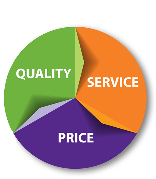
There are always 3 things to consider when making any type of purchase – QUALITY, SERVICE and PRICE. You won’t always get all three, so you need to decide which 2 are the most important to you.
- QUALITY – they look nice, but if you choose to design your cards and other items on their site using their designs it is just that, THEIR DESIGN. That is a problem because…
- These are stock designs – Anyone else can choose the same design including your competition – your business will not stand out when others have the same look
- You do not own the design or the logo you created on their site. Everything done on the site belongs to THEM – you can only use the design on items you purchase from THEM. If they don’t offer an item you are interested in – you cannot put their image on it.
- When you order the “FREE” business cards, they put their name on the back and say “These cards are printed free courtesy of…” Do you really want potential clients to know that you don’t have enough confidence in your business to invest in printing business cards? Your business cards are the least expensive form of advertising there is – and they are also the most important piece of advertising you have!
When you purchase a logo or a design from Handouts – it belongs to you. Please always verify with your designer that the designs are yours before they do the design.
- The design belongs to YOU. You can use it on anything you choose. You can build your company image around that design.
- It will be a design created for you and not shared with others.
- Your competition will not have access to the same design
SERVICE – if you need to contact someone at the online company, you will speak with the person that answers the phone, there is no personal service. When working with a local company…
- You receive personal service
- You are supporting a local business
- Your design will be carried through all of your marketing pieces
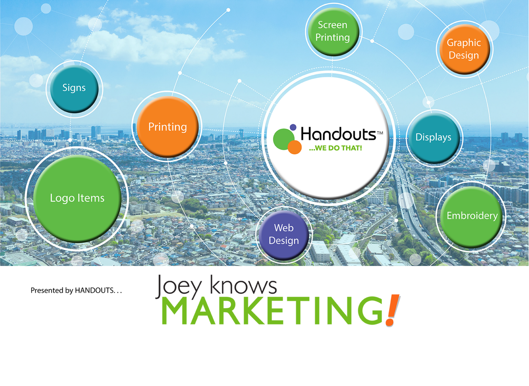
- If you want a specific promotional item or a direct mail or EDDM piece it can be handled through the same company
PRICE – the $9.99 business cards are rarely ever $9.99 once you add in for all of the extras.
- We can’t speak for the printing price from other companies, but at Handouts ALL of our printing prices are very competitively priced with online companies at 500 pieces, and at 1000 and higher, we are actually less expensive with better quality AND your designs will be carried through all of your marketing.
Now you know some important facts that you should consider when thinking about purchasing your printed marketing pieces and how it will effect your other maketing pieces.
If you have any questions, please don’t hesitate to contact us. We would love the opportunity to provide you with a competitive quote on any of your marketing needs! We want to help you grow your business!